The concept of "Glitch Hunter" sprung from a desire to apply tangible gameplay to the various unrelated levels I had been working on, sticking the player in a self-referential, purposefully unfinished product. After unplugging from a long gaming session, the player surrogate finds that ten years have passed, leaving them stranded in a bizarre future, occasionally experiencing hallucinations that they are still in a game. Ideally, the sense of fourth wall demolition would explain differences in lighting and mood, as well as any rough patches in the layout or gameplay.
True to form, I ended up becoming quite attached to the premise, thanks in no small part to my rapidly evolving (and admittedly intoxicating) coding skills. I think that codephobia is the number one thing which holds back budding designers, just as the limitless sense of "I can do anything now!" is in fact a massive stumbling block for those who have freshly conquered such fear. This iteration of "Glitch Hunter" may have buckled under the weight of such liberation, but it's not dead by any means - just sleeping an a cocoon state, metamorphosing into something stronger.


Naturally, a number of creatures have been auditioned in this setting (including sentient kombucha bottles and swarms of luminescent insects), but the most interesting story-wise are the remote drones. Produced by a range of fictional corporations and piloted by housebound consumers, they were designed to eventually fill any number of roles - merchants, civilians, street gangs, protestors, cannon fodder under the control of experienced hackers, you name it. The lack of a working text/dialogue system is one of the really glaring omissions in this attempt, as it means a lot of missed potential for in-game microfiction.


The more brightly colored and visually confusing screenshots are from inside of Glitches, wandering holes in reality which can either help or hinder the player. I acknowledge that they look pretty ugly in this iteration, and plan to constrain them to a fixed palate rather than the "random color" approach which seemed so novel at the time. Naturally, the gameplay specifics of glitches is bound to evolve as different types of levels are played with, and at this point they don't do much aside from allowing the player to bypass the edges of the map.


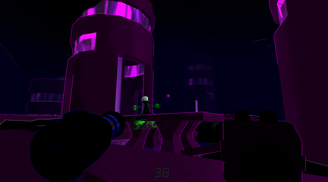
The square, tablet-like device at the bottom of each shot is, fittingly, named the H.U.D., or homeowner's utility device - serving as both the player's visual interface and defense method, it's meant to feel a little out-of-date with the rest of the world's technology. It fits as a sort of gauntlet in the right hand while the left controls the touchscreen, and has a wide range of practical/impractical attachments (flashlight, keychain, CD player). These are installed in pairs and controlled by left and right mouse clicks - which ideally will someday make for a wide range of customizable play styles.


It's probably worth mentioning that a portion of these screenshots are from procedurally generated stages. Random worldbuilding is, in my view, a very interesting method of squeezing a lot of gameplay out of very few assets, and while I certainly didn't nail it here, I at least got a good sense of what not to do. Namely, these maps generate in real-time (a massive blunder, causing flash-freezes every few steps), and have all sorts of problems with altitude changes. Still, a noteworthy lesson, and big stepping stone towards subsequent improvements.


Design-wise, there are some outstanding visual blemishes, like the jarring color choices and inconsistent textures, as well as a general lack of direction in regards to gameplay. Certainly to be expected from a first prototype which did quite a bit of on-the-spot evolution, trying to accommodate a wide range of early programming experiments. While I label my early paper maps as "blueprints," this is really the first thing I've done which fits that word, and I can now recognize that a single hour with a shifting in-dev game like this is more beneficial than a thousand detailed design docs.
 I've always thought that children's playgrounds seem like an underused videogame setting - not only are they inherently modular and multi-path, but they appear in a variety of environments (malls, parks, all manner of neighborhoods) that crop up all the time. While I can see the potential concerns with using such a kit in a shooter (a shame given the range of interesting cover options), it could at least be used in a run-and-hide horror type of game, hence this nightmarish little test level.
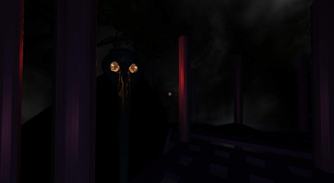


 These further experiments in random terrain generation are the result of a new level-building process I've been auditioning. I suppose technical folks might call it "atmospheric prototyping" - essentially, building and exploring a rough open world, getting a feel for potential moods and components before moving on to layout work.


 After some hands-on experience with a vintage "Battlezone" machine, I decided to temporarily retreat from realism and experiment with a minimalist faux-vector art style. The vector influence may have been lost along the way, but the end result allowed for a looser playspace, a workable sandbox to refine some fairly ambitious systems. Visually speaking, it's certainly a bit rough, but the bold and highly contrasted look is much easier on the eyes than some of my previous attempts, and the game's surrealist, Jack Kirby-inspired weirdness allowed me to play with some unused creatures from my pixel art years.
 The (extremely simple) gameplay here largely stems from an attempt to expand on the unfinished "Glitch Hunter" random level building, which ended up working surprisingly well here. The abstract feel of the world helps to disguise a lot of the seams, and I'm particularly pleased with the feel of the nerve-like root clusters, an extremely simple bit of code which adds near infinite variety to the world. I also cooked up a fairly decent water system, wherein the neon-colored sea will start to rise once the objective is complete, leading to some (surprisingly) tense scrambles to find an exit before the player inevitably drowns. Honestly, these races against time were far more thrilling than the rather half-assed gunplay, and I'm bound to further revise this concept in the future.


 As a narrative-minded gamer, I instinctively wanted to attach a story here - but now that it's behind me, I think that it works better as a mysterious abstract sort of piece, perhaps in part due to its arcade-inspired roots. One discarded premise involved a VR program allowing the augmentation of human memories, in which the player would be tasked by an overbearing client to destroy traces of painful conversations. It's the kind of thing which seems novel when first brainstormed, but reveals itself as too esoteric and convoluted when forcibly inserted into the game. In the end I'm glad I exercised the plot completely, as I don't think the addition of text storytelling would have added much.


 While I don't foresee myself going back to fine-tune this (enjoyable) mess, there were certainly some powerful lessons learned over the three weeks I spent playing with it. Namely:

