Friday, June 26, 2015

Skyrim Mod Post-mortem: Red Elk Reservoir


Having recently completed my first complete mod for Skyrim - a level pack, made up of five scenes from the neighboring city of Jehanna - I've decided to share my development notes here. The experience has been quite eye-opening, so much so that I'm taking a break from multifaceted-but-oh-so-limiting Unity to focus on work with Creation Kit and other dedicated studio tools. More thoughts on this in a future post, but for now: diagnostics on each level, one step at a time.


Overview: Designed to add some complexity to a standalone archer encounter, this tall, open map plays with vertical cover and narrow walkways to make arrows a greater threat.
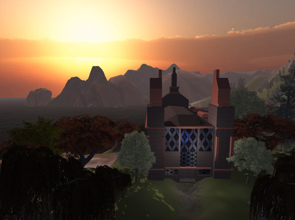
Ingredients: 2 Riften Marketplaces, various Riften canal pieces, 1 Solitude Windmill, and a dam concocted from inflated Dwemer walls and gates.
Light Settings: Standard rain FX. While the following scenes use heavy fog in an attempt to simulate a rainstorm, the more realistic outdoor rain was used here to set the stormy mood.


1: A rainy dock, surrounded by a low, broken down seawall. To the foggy north, vague LOD buildings are barely visible through the storm.

2. The entrance to a deep canyon. The mud-caked road slopes upward here, before revealing itself as part of a rickety wooden canal. On the right, the creaky wooden back gate of the reservoir, at the foot of which is dead bandit littered with Orcish arrows.

3. A rough hole in the wall leads to a narrow drainage chamber, with a gash in the ceiling illuminating the misty condensation. Drips from the ceiling are everywhere - almost as if it were raining inside, were such things possible. A Dwemer pipe leads to the west.
4. The bottom of a towering reservoir, the shapes of Orcish and Nordic buildings dimly visible on the cliffs above. This uneven canal winds through the lowest levels of the reservoir, only offering vague glances at the structures above, including a pair of steam-belching heating pipes.
5. "What was that?" calls a voice from above. A Reachwoman archer dashes across a makeshift wooden bridge, and starts taking aim. She is an unusually nimble dodger, and with her high ground making for easy cover, is set to pierce yet another bandit skull. The creaking walls appear to take the sound of eerie, animal cries - or perhaps it's just a carefully applied, audio distorting, illusion spell?

6. Evading her, however, is easy enough. The canals offer easy getaway, provided the deepwater areas are avoided. In two spots near the east end of the room, caked mud and Dwemer pumps can be climbed, putting the player on equal ground.
 
7. The higher level of the reservoir, made up of three flat areas connected by wooden walkways. The archer from earlier - revealed via CHIMscan to be named Satie Madmarche - is nowhere to be seen, but groups of her pet Red Elk can be found grazing fresh brush. While aggressive, the female elk will only attack if their space is violated, while the males will corner any who dare intrude on their territorial pissing grounds, hitting them with a barrage of knockdown attacks.

8. A perceptive and pacifist-leaning player might detect that Satie is only defending her territory as well, and sneak into the windmill - torchlit to designate it as an exit - undetected. But most bloodthirsty Nord heroes will no doubt be scrambling along the walkways, trying to find a way past the bridge-blocking Bull Elk in search of a memorable fight. Up here, Satie's arrows are a bit more dangerous, with limited space for sidestepping. Cornering her, or knocking her below where she loses her advantage, can even the playing field a bit.

9. Careful sneakers and thrillseeking murderers alike can find Satie's camp here, which offers loot, a comfortable bed and firepit, and a diary offering her somewhat tragic backstory - hopefully, tainting the thrill of victory with a healthy dose of bittersweet guilt.

Commentary:

An early level, and home to some classic novice missteps. As should be obvious, the scale is more than a little ambitious, and the large central area limits the ability to roombound - meaning framerate drops are hard-wired into the stage's DNA. When learning a new toolset, it's arguably more important to figure out what *can't* be done instead of merely what *can*, and a recklessly ambitious design like this certainly yielded a few hard lessons.

Once upon a time, the central area was more enclosed, with smaller walls blocking off sections of the main pit - an attempt to safeguard against long view distances, but one which simply doesn't work with large, multisided pieces like these Riften Marketplaces. Opening it up did enhance the general flow, and also creates an incredible sense of scale - although there's definitely a cost performance-wise, and I can't imagine attempting a layout like this, knowing what I do now.

The drainage canal through which the reservoir is entered is a frustratingly linear area, hastily assembled after a few fumbled starts. This budget solution does get the player from one key point to the next, but only by cheaply pushing them through a relatively ugly corridor, far too early in the scenario for such a misstep. A more subtle flaw lies in the attempts at makeshift walkways, which match too closely with the Riften set used on the walls, and therefore don't look at all like something assembled by one woman and four Elk, in a few turbulent weeks.


On the topic of Satie and her pets - they're the real stars here, and on most plays outshine the flaws of the setwork. Archers in Skyrim tend to be used in support roles to melee enemies, but here, this relationship is inverted, with relatively weak close-range units blocking player progress and trying to knock the player into positions where arrows are unavoidable. The encounter also has some healthy moral complexity - most players will probably attack someone resembling a Forsworn bandit on sight, but any who read Satie's diary will likely find themselves wondering if a confrontation was in fact necessary. As nonlethal options are becoming one of the most fascinating (and sparsely explored) frontiers of gaming, encounters which raise questions of necessity have an inherent memorability, which sets them apart from the old fashioned "kill all the bad guys" school of level design.

Many of the outdoor illusions in this scene would have no doubt worked better in the context of a worldspace (something I didn't feel comfortable touching on a first mod) - as it stands, there are a number of inconsistencies with the following area, though they may only be noticeable to detail-obsessed level designers like myself (and possibly, yourself). While most of the scenes in this piece pride themselves on economic lighting choices, this one uses outdoor lighting to achieve the mood-setting rain effect, which renders the few lights used less effective - possibly even redundant.

Tuesday, April 28, 2015

Failed Experiments: An Analysis of Some Unfinished Projects

While cleaning out an old hard drive, I re-discovered several old, unfinished level concepts. While they're undeniably a mixed bag, I figured it would be an enlightening exercise to look back at what went wrong with each - as well as which tricks I learned to refine in the future.

Map 1: Sangelis Zoo
Premise: Inspired by the ruins of the old Los Angeles Zoo in Griffith Park, this exploration-themed level is probably the best laid out of the batch - which isn't saying much, as it's pretty jumbled and would benefit from a redesign. The player makes their way from an elevated canyon (A), down a long cramped stairway which leads into the first, and largest, cage area (B). Once outside, they find a road washed away by a flooded river (C), which leads past some smaller cages (D) and into a wooden observation platform (E). From there, they can take the staircase at the back of cage F, and leap over points G and H to make their way to the rooftops of the cages explored earlier.
What worked: While these chunky meshes are something I would never dream of working with these days, they do have a "prehistoric skeletal" feel that would be lost had I been wise enough to use more workable shapes. The map also marks the first use of one of my favorite perspective tricks - two rows of palm trees positioned on the other side of an inaccessible exit (in this case, the flooded road near the bottom), suggesting a road which lies just beyond the path-blocking obstacle.
What didn't: This map suffers from several big problems, the most obvious being that its building blocks are ugly, high-poly, and functionally impractical. This became painfully clear when trying to lay out the upper areas of the map, which led to the stage being scrapped. While this was based on a paper concept, it still feels extremely unfocused, and any second attempts at this concept would ditch the clumsy prehistoric cave feel for some strict geometry and a more open layout.
 
Map 2: Martian Memory
 
Premise: I was approached about working on an interplanetary shooter, described as a Mass Effect-like game during an early human colonial period. While I'm always skeptical of an indie project which names an enormous franchise as its inspiration point, I did throw together this conceptual sketch - a red Mars-like desert, with its deep ravines and organic cover designed with tense sniper battles in mind. The journey takes players from a relatively open valley (A) through some branching, dark crevices (B, C, and D). Upon reaching point E, they find a gradual slope which can be climbed to the towering rock formation (F) visible from key points in the earlier portions.
What worked: Once the player climbs to the plateau, the illusion that they are on an endless plain is surprisingly strong - with the chasm now forming a natural barrier preventing anyone from walking off the edge of the map. In retrospect, I should have started players with the plains view and then worked down into the valley, which would have been a great trick at enhancing scale. Testing the chasm out with placeholder enemies revealed some interesting cover dynamics - long, sporadic sniper battles are one of my favorite encounter types, and a map like this (with its long view distances and unpredictable corners) makes for tense moments and on-the-fly strategic experimentation.
 
What didn't: While designed for a linear project, this map would truly work better as a small open-world area, with more branches and pathways. The tall rock formation makes for a weak central element - though, with a more mazelike series of canals, it makes a nice anchor for lost players to try to get their bearings. But the big mistake - color has never been my strong point, but I'd say this garish pink and red scheme is one of my worst missteps in that department. I don't advise anyone look at the final screenshot without proper eye protection, or it could permanently damage your gaming abilities.
 

Map 3: Lake Shoshago
 
Premise: Another "proof of atmosphere" map, this one built for a small indie studio looking for a "Lovecraftian tone." I tend to forget that, while Lovecraft might mean psychological gloom and metaphysical paranoia to me, it seems to mean "survival horror" to many in the industry. But I digress. This rancid, volcanic Oregon lake is believed by the backwoods locals to be a sentient entity, and there are rumors that a secretive cult of natives once congregated in the circle of rocks in the central island.


What works: In short, not much. The towering background hills do succeed at creating a sense of scale, but it really just highlights the smallness of the map, as well as its poorly defined borders. The "daylight horror" atmosphere is okay, but doesn't make up for countless other shortcomings.
What doesn't: In short, almost everything. The straightforward spiral shape should make it obvious how little was planned out beforehand - it's essentially one half of a not-very-good map. However, there were some important lessons learned here regarding what not to do - namely, don't expect atmosphere alone to carry a piece.
 Map 4: Moran Bay

 Premise: This isn't so much a map, as it is a small virtual town somewhere in Washington State. Basically, I was concerned that my standard settings - either dystopian suburban or fatalist ruins - would seem depressing to anyone who doesn't follow the industry. So I built this "nice" town, with some ambitious architecture models and experiments in scale.

 What worked: The background has an immense feeling of scale thanks to a number of perspective tricks. For one, the billboard trees which cover the mountainside actually get smaller the further up they are - a subtle trick which, while expensive, works wonders. Distant mountains, like those across the bay, are treeless and silhouetted by fog - and so look further away than they are. While it doesn't show up in still images, the water level rises and drops with a wavelike rhythm - though I still think it needs some cheap effect (i.e. non-particle) to simulate foam.
 What didn't: I think the most important lesson learned is the value of simple, modular buildings. These structures are more complicated than they ever should be, and *so* much more could have been done by assembling isolated components (focusing around primitives) into full buildings. Fortunately, this map was never intended as a playable level - if it had been, I would be giving myself a hard time over the very haphazard building placement and use of too many tree types.

"Bigsby Bridge" Level Samples and Analysis

The trickiest part of designing outdoor levels is balancing clearly defined borders with an artificial sense of scale. As games have become more open-world, the idea of an "invisible wall" seems to have grown more and more offputting to gamers - which makes borders a design challenge for linear stages. Steep canyons offer a solution of sorts, by using the limits of a player's climbing ability as a sort of metawall. This Big Sur inspired map attempts to utilize this narrow game space for a number of illusions - most notably, a "sunset effect," in which the main directional light seems to get dimmer as the player moves deeper into the level, behind rows of increasingly elevated cliffs and trees.

 The level starts as the player exits a coastal tunnel to find a panoramic view - and a partially collapsed bridge. Following a narrow cliff down the steep sandstone leads to the beach, where a path leads into a densely forested canyon. The idea for the forest portion was to create the feel of a deep woods with as few trees as possible, through use of some subtle perspective tricks.
The largest trees are positioned around the entrances to darker areas, giving them a different look depending on which side they're viewed from. Initially, these dark portions had hanging branches overhead, intended to give them a sort of "inside" feel, but it felt a bit unnatural with tall, slim pine trees as the main feature. Cliffside vegetation is subtly smaller, giving an illusion of distance - a trick which can only be used with organic shapes like trees, and can feel pretty tacky if not done carefully. I will admit that these vegetation experiments are not entirely successful here - while parts work stunningly, I think it would have been more successful with a more open layout.
These ugly placeholders are meant to represent the lime kilns of the appropriately named Lime Kiln State Park - rusty, decomposing structures buried in the forest. While they could certainly benefit from new models and textures, I quite like their dramatic shadows, cast by the now-distant bridge. The eye-like shape on the left kiln marks it as a container for secret treasure, while the (admittedly barely visible) waterfall behind is the source of the river which flows throughout the level.
 Looking back at the bridge, the sun appears to have set entirely - but the directional light hasn't moved at all, nor have the ambient colors changed. This is one effect that I'm truly happy with, and I'm anxious to try it in a larger, more carefully planned, level - preferably with a more attractive color than grayish purple.
While it's not something which comes across in still images, the level also features my most successful attempt yet at tidal emulation. The ocean's water level rises and falls to a regular rhythm, which interacts with the smooth, but slightly uneven, incline of the beach. It's a nice effect, but still not perfect - up close, the animated foam texture ruins the illusion, as it fails to sync up with the crashing waves. It's a step towards something I'd really like to perfect someday - but more practical in an indoor stage which prevents the player from getting too close to the waterline.
There's a lot in here which doesn't quite work - the colors are a little tacky, the vegetation effects are hit-or-miss, and the layout is pretty poor. Given another chance, I would have forsaken the "wide canyon which gets slimmer" approach and stuck with a narrow ravine which zig-zags its way inward, limiting the costly vistas whenever possible. It's a personal goal to figure out how to get the most "forest feel" out of a compact space, as I think "outdoor dungeons" are a great method for giving an open feel to a linear space.

Thursday, February 12, 2015

Glitch Hunter - level previews and story/gameplay overview


Project Glitch Hunter has made some notable strides since last featured here, thanks in no small part to a short break to work on less ambitious projects - figuring out some clever design tricks in the process. Most notably, there's a sense of increased scale, as the panoramic cityscapes featured in this episode might suggest.


By far the biggest challenge with this game has nothing to do with code or collisions, but knowing how to answer that cursed question, the bane of aspiring artists everywhere - "what's it about?" I imagine that established creators are able to dodge this question, and let their narrative ambitions speak for themselves once the product is finished. Of course, those of us who have yet to reach that point have no choice but to write inane "back-of-box summaries" like the following:


"New Year's Eve, 1999. Your eagerly anticipated Christmas gift has just arrived, a prototype virtual reality console complete with copies of the newest hit games. You decide to forego the traditional festivities and stay in, excitedly booting up the system."

"Fifteen years later, you log out to find yourself connected to a life support machine, your console having been affected by a massive network glitch at the stroke of midnight. As you root through your old apartment, you piece together that you aren't alone. The entire internet was lost in a moment, only to be gradually replaced by limited networks managed by corporate superpowers."

"Stepping outside, you barely recognize your once-familiar Californian suburb. Most residents have chosen to relocate to state-of-the-art smart condos, with former cities now populated only by consumer-controlled remote drones. The skyline is dominated by construction sites and decaying mega-malls, with low-flying hot air balloons providing regional satellite internet. Countless unfinished renovation projects decorate the decaying cities, stuck in development limbo thanks to unprecedented, violent shifts in the coast's weather."

"Armed only with an archaic Homeowner's Utility Device - a mobile communications device and all-purpose toolkit - you now must make ends meet by doing odd jobs for housebound employers. But in doing so, you only find a growing mystery, with impish hackers and corporate spies hiding behind innocuous usernames, and rumors of strange, distorted creatures living in the few remaining wild areas, said to defy the laws of reality. And somehow, at the center of it all, is you - an uninspired, out-of-date gaming addict with the lowliest of job descriptions - Glitch Hunter."


A few notes, in regards to setting:

I have a confession: in spite of my fetish for abandoned structures, I think they're on the verge of becoming overdone in a game context. From a level design standpoint, it's easy to see the draw: it's easier to give a building a linear structure with convenient "pathblockers" like rubble and collapsed tunnels. But with a few notable exceptions (most notably, some of the set pieces of Fallout and Bioshock), game ruins rarely feel like they were ever part of a functioning world. Part of the Glitch Hunter mythos is that California has become stuck in a state of continual renovation, with modernist, 3D-printed towers being appended to the stucco faux-Victorians of its suburban period. Fact is, a construction setting can make use of the same pathblockers as a ruin, but also have the potential to open up a level's structure as well as its potential for story (with each neighborhood having a sense of history as well as plans for the future).


I've always found text to be one of the most fertile methods for in-game worldbuilding, but it's almost always done on a larger scale, with found notes or computer terminals containing several-paragraph entries. One of my goals here is to do more with microtext - randomized store names, station names, and news headlines can be seen in some of these previews, and I also plan to implement historical markers, "coming soon" posters, and advertisements to give the world that much more flavor. There's also a system for intercepting conversations from the drone NPCs that populate the world, but details will have to wait until I revise their AI script in the coming weeks.


Personally, I find it hard to get invested in narratives which don't at least poke at the fourth wall, and games seem ripe for meta-humor, given the way their immersive nature often contrasts with their less realistic conventions. And yet, I have yet to see a game which satisfactorily acknowledges glitches - the most unique and unpredictable element of player experience. Important distinction: I don't think "crafting a game which acknowledges, and plays with bugs" is equivalent to "rushing out an unfinished, broken mess." Rather, I think there are some exciting narrative possibilities for a world in which the inevitable rough edges are a central part of both the lore and the gameplay.


A quick tour of the Level Generator:

Yes, this one of those "procedurally generated" games that you know and either love or hate, with more of an emphasis on narrative and open-world exploration than many of its brethren in the trendy "roguelike" camp. The player travels to new areas via a long-abandoned, experimental high speed subway train, and, after finding a route to the surface, can complete optional clue-and-cash seeking quests while investigating each unique world. Part of the charm, I think, is that the fun of exploration multiplies exponentially with each new level component added, as different sets of scenery combined with weather and lighting effects can completely transform the feel of an area.


For those interested in the technical bits: Each neighborhood is assembled from a chosen set of "blocks," laid out over a background terrain. Blocks are somewhat multi-layered - while the layout is based around the central street level, there are also jumbled subterranean sewers and rooftops, which form their own emergent patterns. For example, a billboard or freeway sign can form a bridge between rooftops, or work as a makeshift sniper's nest, depending on its surroundings. In city settings like those pictured here, street blocks check for empty adjacent areas, and then generate connected streets as well as buildings, canals, and overpasses. This system also works for multi-block buildings like malls and apartment complexes. Once a certain number of blocks have been placed, the generator instead creates "End Blocks" - structures like construction sites or parking lots, which are less complex and also provide a level-friendly explanation as to why the street might suddenly end.


I've also crafted a pretty efficient "random forest" system to add some variety to the standard terrain. Unity's built-in tree system is honestly only any good for brushy undergrowth and distant details, given the lack of rotation and some unpredictable billboarding kinks. My approach is to augment this system with clusters of mesh trees and rocks, which have customizable rotation and scale variation. It generally works best when used in small clusters of less than five trees, though it has also shown mixed success with adding rock formations and sparse vegetation to large, open areas. It's a system which is still evolving, but has definitely moved past the "what can it do" stage to the less daunting "when should I not use it" movement.


I imagine that procedural generation is somewhat controversial among game designers, and can certainly see why. Purists likely consider it a cheap solution to let random levelbuilding become a replacement for intricate level design, with the resultant worlds sacrificing structure and purpose for the sake of scale and novelty. It's a viewpoint that I can certainly understand, but I don't think it should dissuade those with interesting ideas for procedural content from experimenting, as it can provide some interesting insights into modular design, the centerpiece of good gamebuilding.

As for the question of "why procedural generation over set level layouts," I'd say it's just a matter of wanting a higher "bang for buck" ratio - the game's replay value is already pretty substantial even in these prototyping stages. Besides, experimenting is both fun and informative, and exploring shifting mazes like these has already provided some important insight on the developing mechanics.


Next episode: Revised NPC/enemy behavior adds some actual challenges to the game world, in the form of a brief mission synopsis. Also, some designer's commentary on the evolving nature of challenge in games - coming soon to a home computer (or mobile device) near you.